back to all cases!

Agilence
Led the design of a highly configurable Receipt Builder feature, transforming the user experience for diverse business needs across multiple industries and boosting the company's competitive edge.
New Feature Creation & Design
Overview
During my 5-month internship at Agilence Inc., I had the opportunity to design a new feature premiering in the enterprise product with a brand new design team. This came with the challenge of designing for specific user-defined constraints for 5 different verticals and hundreds of different use cases.
I also worked to modernize design system components to ensure visual consistency for the design team moving forward, and to improve competitive curb appeal.
Role
Lead UX Designer in Product teamDesign challenge
Conceptualize a new feature for multiple verticals and use casesTimeline
May 2024 - June 2024 (5.5 weeks)Role
Lead UX Designer in Product teamDesign challenge
Conceptualize a new feature for multiple verticals and use casesTimeline
May 2024 - June 2024 (5.5 weeks)Let's break my process down:

the context:
problem statements, goals, considerations
01
initial exploration:
user personas, interaction and context research, wireframes, and flows
02
refinement:
iterating within development and user confines
03
testing and iteration:
conducting usability tests and iterating
04
results:
impact, takeaways, and significance
05
the context:
problem statements, goals, considerations
01
The Problem
Receipts, at the time, were hard-coded in Agilence's Analytics product. Therefore, modifying receipts is incredibly inefficient and requires out-of-product solutions.
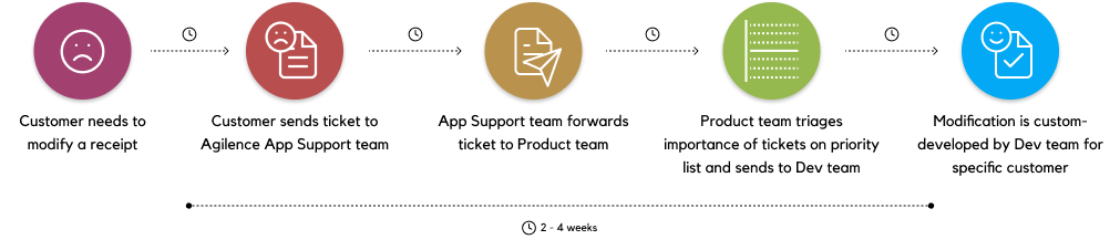
Businesses were unable to configure their receipts to their specific needs, thus impacting user satisfaction and operational efficiency.
How might we give our users - with diverse needs - a simple way to flexibly customize receipts for their own teams?
The ideal flow:

The Context
Viewing Receipts is a core feature in Agilence that allow users to view real transactions and operations. Analysts use receipts to understand more about flagged transactions and check for suspicious behavior.
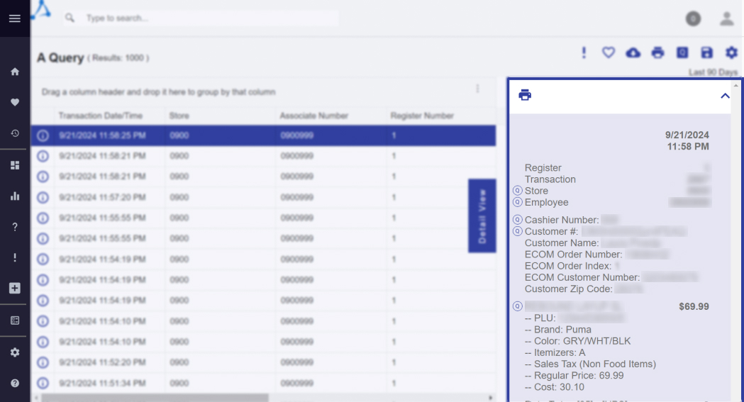
Sensitive customer info is redacted for legal and privacy reasons.
The needs of Agilence customers are very diverse, ranging from privacy and security concerns, to examining specific transactions with specific coupons.
During this process, there were additional things to consider as well:
Old Product, New Team
Until a year prior to my arrival, Agilence's Design Team did not exist. There were few design standards and our team was small - meaning every member had a large say in feature design.
(re)Design the Design Systems
I had to modernize the product design for new feature releases to increase curb appeal, while keeping familiarity with old design systems for customers who had been using our products for over 10 years.
initial exploration:
user personas, interaction and context research, wireframes, and flows
02
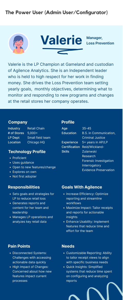
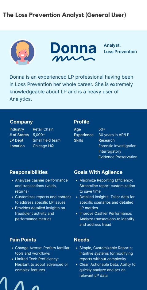
Who's Who: Users and Personas
Understanding the users at the heart of the early stages of my work. But difficulty arose due to the amount of verticals which had to be considered for all the different ways a receipt could be used:
- 1. Retail & Supermarket - For transactions (ex: items bought, discounts applied) as well as overrides etc.
- 2. Pharmacy - For Rx dispense details (ex: price, Rx ID)
- 3. Restaurant - For takeout transactions, checks, waiter status, etc.
- 4. Hospitality - For check-ins, status, etc.
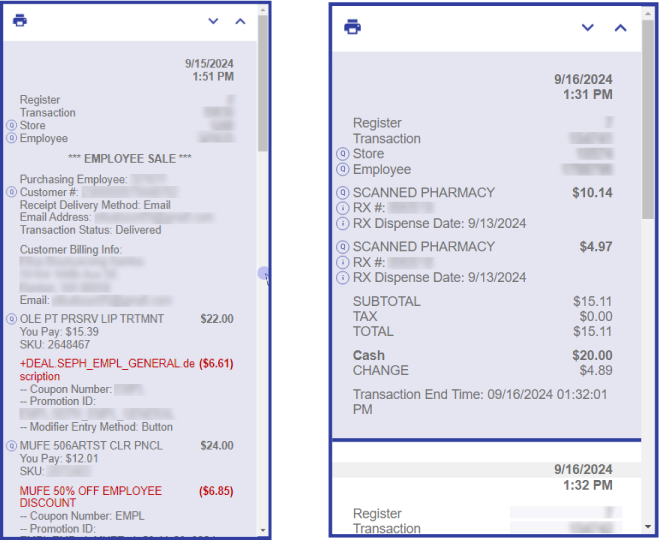
Examples of customer receipts: cosmetics retail (left) and pharmacy (right).
Sensitive customer info is redacted for legal and privacy reasons.
Researching Context of Use
User Interviews, Project Briefing
Kicking off our research with user interviews was a great way to dig into existing user behavior and expectations:
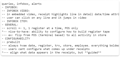
Checking What's Hot - Heatmaps
DataDog was our primary analytics tool for tracking user behavior. One feature that we used to best understand our users was heatmaps. Takeaways:
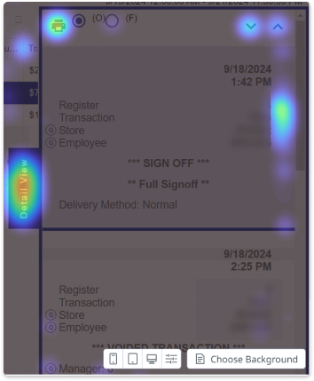
All information collected gave us a broader understanding of how users interact with receipts: what users read, how they read it, preferences while interacting, and why.
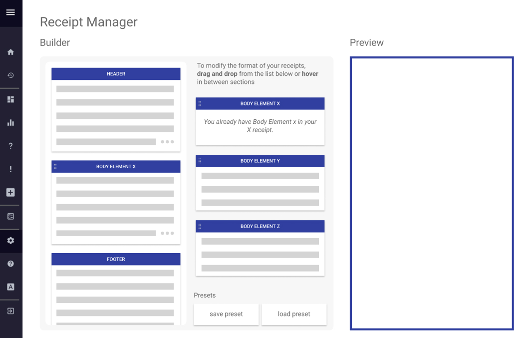
Wireframing with Efficiency at Heart
1. How do users read receipts?
Users look up and down, making use of the vertical scroll. As such, we can tailor our receipt designs towards actions like these.
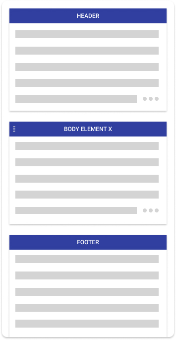
2. How do users break down receipts?
Header, body, and footer.
Header = transaction level data (store, employee, date/time, etc)
Body = things that happen in the transaction (an item sale, return/refund, etc.)
Footer = what I assumed to be a recap of the transaction/event (transaction totals/costs)
What if...
I had a crazy idea: What if users could drag relevant sections in and out of the receipt? This wasn't an interaction that existed anywhere else in the product. Add a preview that visually resembles the existing detail view…
What if...
I had a crazy idea: What if users could drag relevant sections in and out of the receipt? This wasn't an interaction that existed anywhere else in the product. Add a preview that visually resembles the existing detail view…
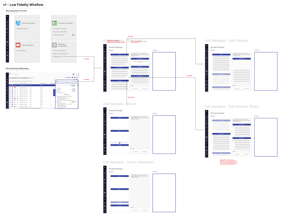
Wireflow
To fully capture the feature, I created a low-fidelity wireflow to understand how a user would interact and navigate the new feature.
refinement:
iterating within development limitations and user expectations
03
Designing with our Users in Mind
1. Guardrails
One of our goals was to give admins as much control and configurability to achieve goals specific to their needs and verticals. However, too much control may result in non-recoverable destructive changes. However, too much control may result in non-recoverable destruction.
For optimal user experience, we were careful to ensure that this new feature was impossible to break. This included:
2. (re)Designing systems & user interactions
Throughout this project, the other designer and I worked on recreating elements from the design system to make all instances of individual components feature consistent, a step up from previous designs in the product. This worked towards our general goal of a concise modernization of the design system.
testing and iteration:
conducting usability tests and iterating
04
Prepping for Usability x Preference Test
Setup
- 1. 60 minutes, 2 designs
- 2. 12 users split into 2 groups; 30m for each
- 3. Given set of tasks reflecting day-to-day repsonsibilities
What Were We Looking For?
A Fork in the Road
Throughout this entire project, another designer had been iterating a different variation of the same feature. During this usability test, we were interested in:
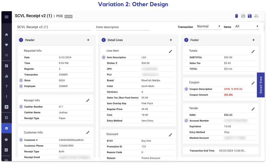
The Big Picture
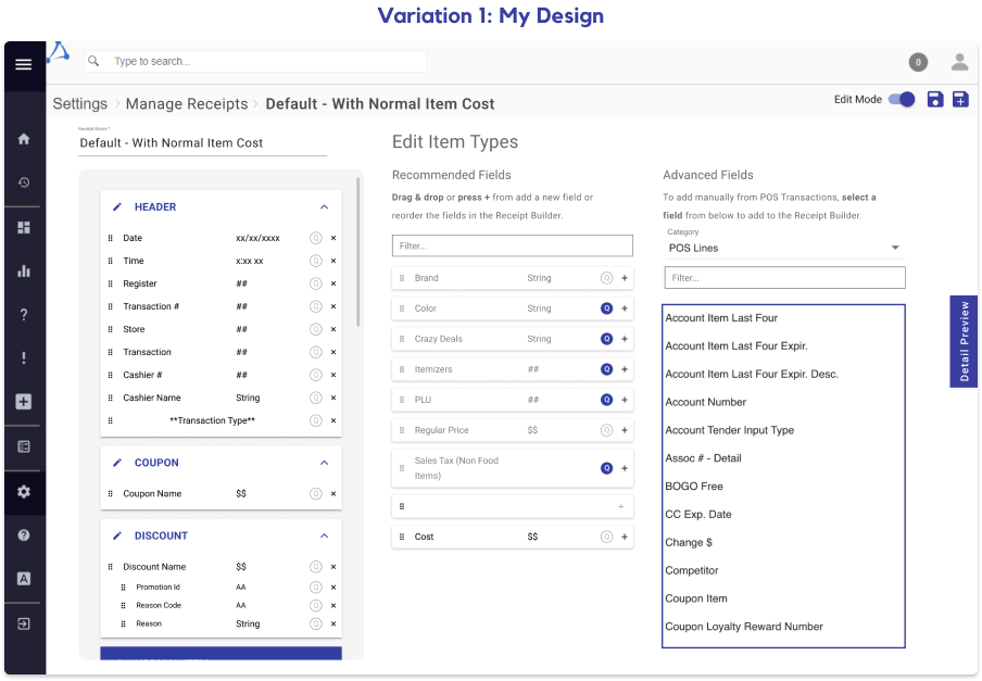
Preference For My Design
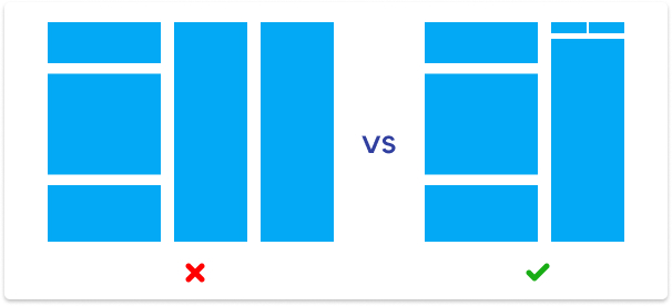
Users felt that the groundwork for my design was more intuitive. For an example, receipts laid vertically rather than horizontally across the screen took far less time for users to understand.
→ This was the deciding factor between the two designs, and we opted with my design moving forward.
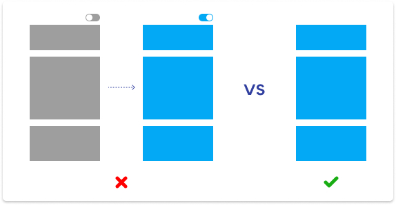
Users don't read
The product team experimented with a mandatory “read-only” mode upon entering the page. However, user behavior quickly showed that they were annoyed as they couldn't interact with the features on the page. Moreover, the “read-only” mode, which was intended to force users to read instructions on using the page, failed at its only goal: not a single user wanted to read.→ We took out the “read only” mode and adjusted the design further to be more intuitive via iconography, layout, and more.
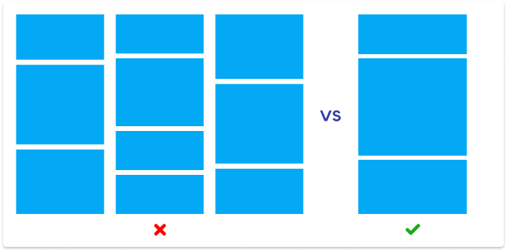
Users are overwhelmed
Some users were overwhelmed, confused, and had negative reactions by the amount of information conveyed on the page on some parts of both designs.→ We repositioned elements of the page to account by grouping similar functions and adding microinteractions to maximize visual information and encourage a more responsive experience to the user.
→ We made more use of white space and margins to reduce the effect of visual clutter.
The New Standard in Agilence Features
After polishing up the design, the time came to hand off the first major feature finished by designers in Agilence history.
results:
impact, takeaways, and significance
05
🚧 Quantitative data coming soon. Stay posted! 🚧
Thanks for making it to the end!
designed and developed
by Jocelyn Chiu
(that's me!)