

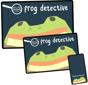
frog detective
The Frog Detective trilogy by Worm Club needed a visual upgrade to boost user engagement, retention, and sales.
Responsive Website Redesign
Overview
I redesigned a website for Frog Detective, a video game trilogy developed by Worm Club, over 20 weeks to be responsive for 3 different resolutions, aiming to increase business prospects by using storytelling tactics to increase user engagement.
I took advantage of the unique interactivity of the video game by making the site resemble the product, all while self-teaching microinteractions.
Role
Solo UX DesignerDesign challenge
Redesign a responsive web design to drive more traffic to product purchaseTimeline
September 2022 - April 2023 (20 weeks)
Role
Solo UX DesignerDesign challenge
Redesign a responsive web design to drive more traffic to product purchaseTimeline
September 2022 - April 2023 (20 weeks)Let's break my process down:

the crime:
original website's pitfalls, UX research
01
the framework:
wireframing, branding
02
solving the case:
prototyping, smart animating, gameifying
03
my reflections:
another case solved!
04
the crime:
original website's pitfalls, UX research
01
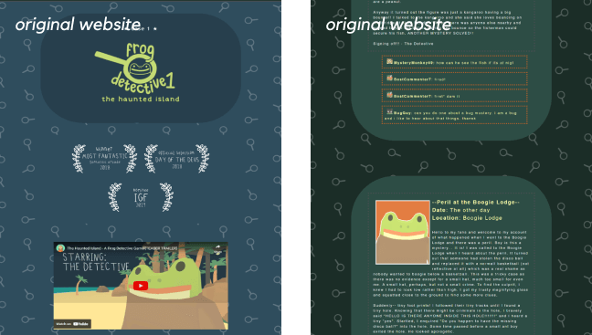
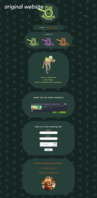
The original, while good, has problems...
Frog Detective's original site fell short of capturing the quirky and loveable experience of the product it was trying to market.
I knew that I wanted to make the redesign of this website true to the product. As such, most of my assets were derived and influenced not from the original website, but from the Frog Detective game itself.
How might we drive more traffic to Frog Detective by making the user experience more memorable?
I derived four goals from user pain points:
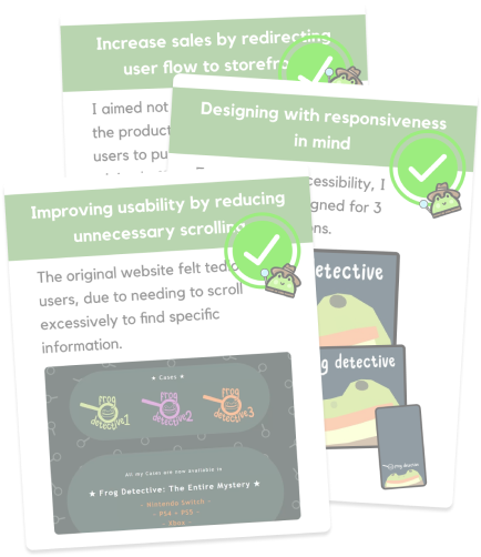
Improving usability by reducing unnecessary scrolling
Promote engagement by enhancing visuals
Increase sales by redirecting user flow to storefront
Designing with responsiveness in mind
Identifying the User
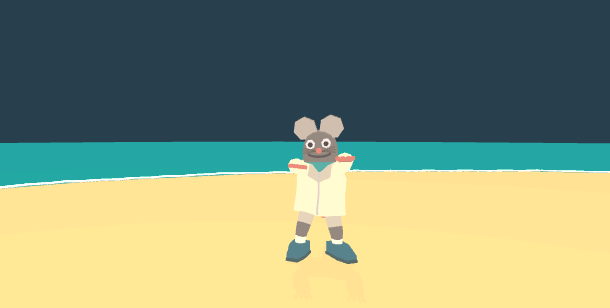
Meet Drew Hops: the mythical user who loves all things quirky, interactive, and cute; the ideal person who would check out a website like Frog Detective. Details were determined through an analysis of player demographics.
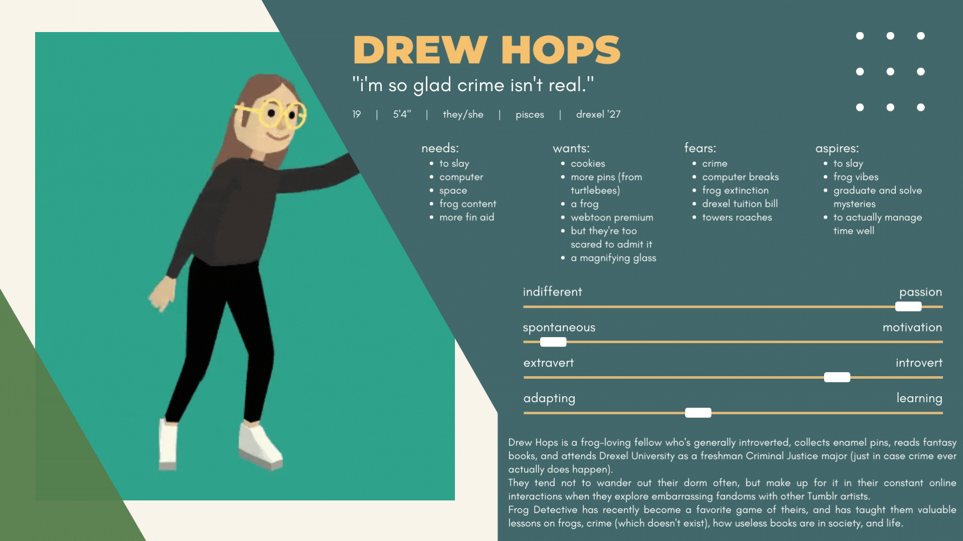
Drew Hops is a frog-loving fellow who's generally introverted, collects enamel pins, reads fantasy books, and attends Drexel University as a freshman Criminal Justice major (just in case crime ever actually does happen).
They tend not to wander out their dorm often, but make up for it in their constant online interactions when they explore embarrassing fandoms with other Tumblr artists.
Frog Detective has recently become a favorite game of theirs, and has taught them valuable lessons on frogs, crime (which doesn't exist), how useless books are in society, and life.
the framework:
wireframing, branding
02
Organizing Information Architecture
Basic usability tests of the existing website helped me discover the following issues with the site's architecture:
- Navigation issues - users could not find some information due to nested page structures
- Missed information users missed curcial information due to unintuitive page structures
To approach this problem I broke it down into two overall steps: a card sort, then a sitemap.
Card sort:
Card Sort
I ran a cart sort with target users like Drew to determine the most efficient and predictable sitemap.The goal of this exercise was to see how useres would categorize content according to their mental models. Averaging the answers resulted in the following:

Sitemap
As a result of the card sort, I knew what content users expected to find based on where they were looking.
Below is a before/after of the sitemap, including the content that both websites had.


Wireframing
After creating the sitemap and identifying my primary user, I embarked on creating my wireframes for the three different resolutions, seeking feedback afterwards:
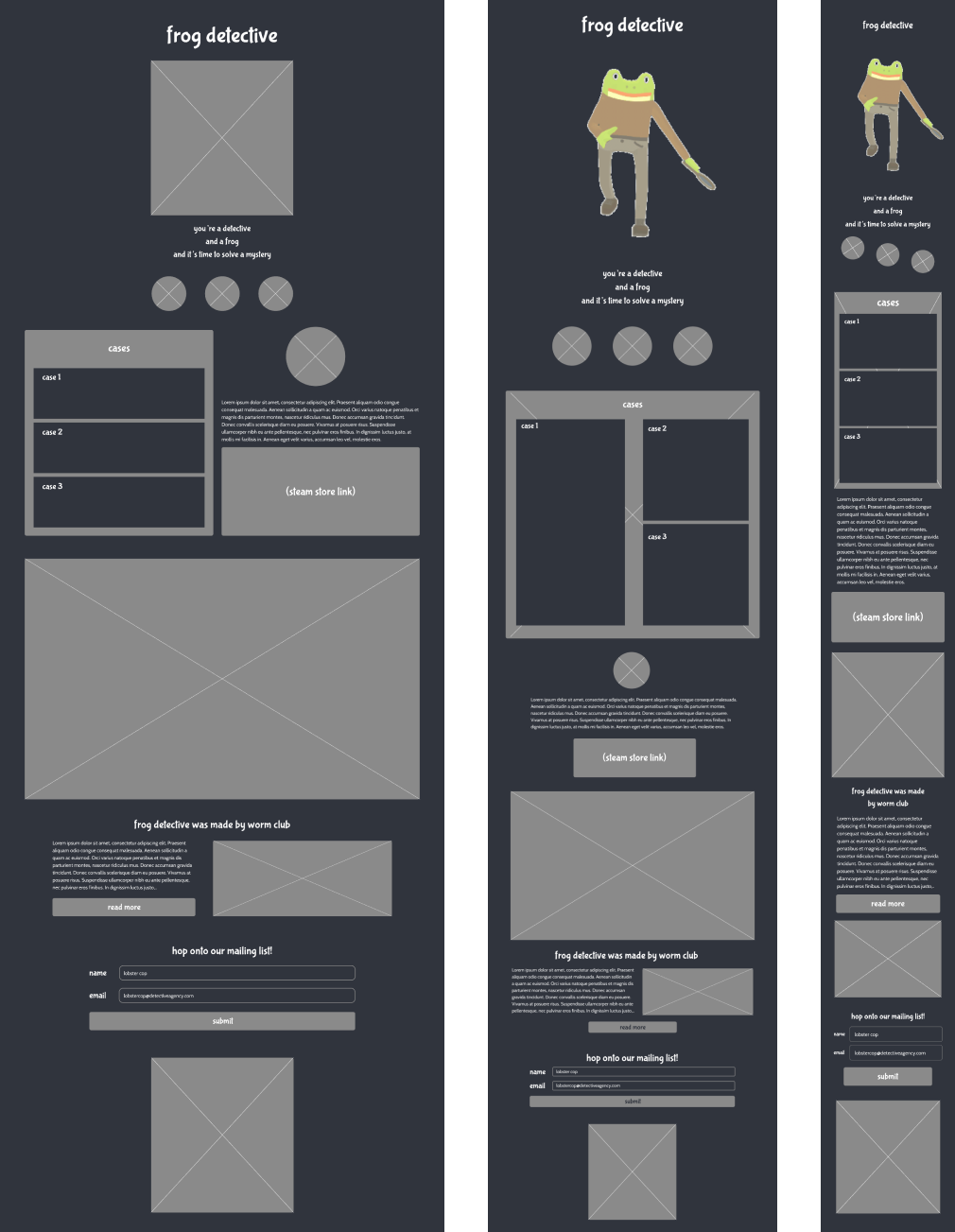
Responding to Feedback
"Your wireframes are good, but... they just seem so boring."
-- Professor C. C.
Feedback from a senior designer gave me a new perspective: to take advantage of the quirkiness of the product and take advantage of creativity, by breaking away from the expected.
My Takeaways
Upon reflection, I set to rectify the following for my next steps:
- White space: Correctly uitilizing spacing encourages a more dynamic and whimsical feel that reflects more accurately on Frog Detective.
- Utilize existing brand: Frog Detective has a uniquely indie feel that should be reflected on its promotional materials using existing assets and tone.
- Most importantly - be fun!
Branding & Style Guide

Colors
The color scheme below was derived from the product itself. Primary colors came from:
- The protagonistt's character design
- The thematic palette from all three installments of the Frog Detective trilogy
Fonts
The fonts were handmade and encrypted in the game files. This constraint led me to find a suitable alternative matching the product's aesthetics.
- Bubblegum Sans was chosen as a header font due to its similarity to the original font
- Cabin was great for paragraph text as it gave modern impression with rounded motifs, resembling the low-poly models of the Frog Detective game
Tone & Aesthetics of My Redesign
Reusing Assets: Things Get Interesting...
Now that I established brand, how could I reflect the playfulness of the game in the form of a website?
While I researched assets of the game itself I found some .GIFs from the original game which showed promise.
The gears of my brain turned when I saw Frog Detective on a phone:
- What do people like Drew like about Frog Detective?
- → It's the simplicity of the characters and immersive gameplay interactions.
- How can I incorporate this into my own design? Or...
What if I could emulate those characters?
solving the case:
prototyping, smart animating, gameifying
03
Revisiting the Problem
At this point, I've established infrastructure to solve 3/4 of the goals I had planned. However, the last problem stood to be most relevant.
This evolves into a more complex problem in itself.
Promote engagement by enhancing visuals
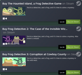
How might we tell a story to compel users to purchase the product, using existing assets?
Solution Ideation
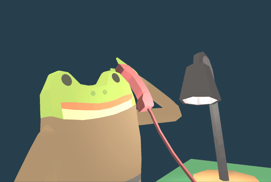
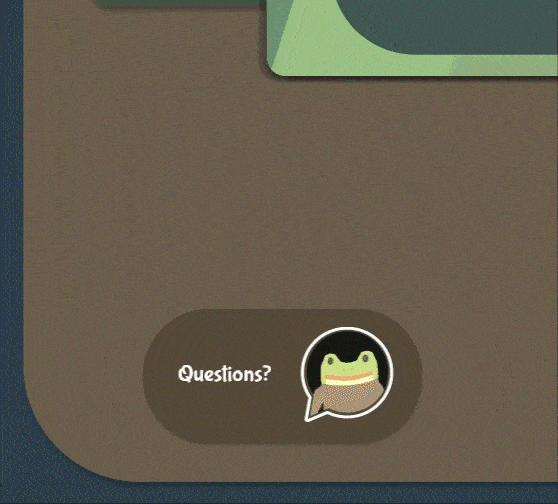
Academic research in the field of digital media led me to understand the importance user/player immersion via storytelling. After playing the game, in an inspired frenzy, a vision became clear in my head: a dialogue with Frog Detective.
Telling a Story
The result is a living, breathing simulation of a conversation with the protagonist of the series, going beyond all expectations in fulfilling the goal of immersing my user in the Frog Detective dimension!
Feedback from Usability Tests
Throughout the process, I made many adjustments, keeping a focus on users like Drew to ensure a positive user experience. Changes I've made include:
- Indicators for page scroll
- Ways to go back to previous screens
- Use of animation for essential information
- Altered dialogue for new vs. existing users
Smart Animate & Microinteractions
I also spent a lot of time with Figma's "Smart Animate" feature to create smooth microinteractions.
This was my first informal introduction to microinteractions and taking my designs to the next level(read my Cosmotea case study for more), and allowed me to make satisfying transitions for this redesign.It was a very light-hearted venture, but a general theme of my work is that I love pushing the boundaries of expectations and what I can do.

At the end of my process, I had a full prototype across 3 different screen resolutions (desktop, tablet, and mobile) ensuring full responsivity for every feature for development.
My Figma workspace had prototyping crisscrossing all over it, which was fun to look at.
But guess what's more fun to look at?
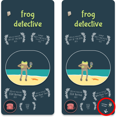
Here's my final product! Interact with the live prototypes below.
my reflections:
another case solved!
04
By far, Frog Detective was an extremely interesting, unique, and liberating project. I'm grateful for the experience, because it definitely demonstrates my artistic capabilities within the realm of web and app design. This assignment was an incredible exercise in translating my design ideas to Figma on a more advanced level than the other projects listed so far. As of yet it is my proudest Figma project yet, and has been received with great appraisal from those of the target audience.
My primary takeaway from the project, aside from the hard skills I've learned and the problem solving required to achieve things, is to (1), never disregard my creativity, or trade it for practicality when I can; and (2), manage my time better. I spent most of my time unwisely figuring out what to do, but never actually embarking on its creation until time neared its end. Regardless, the project turned out to be one of the most highly regarded in my class, and I only wish I could've spent more time refining the smaller details.
Thank you for making it to the end!
designed and developed
by Jocelyn Chiu
(that's me!)