

cosmotea
Conceptualized, researched, and designed an app that solves the stress of ordering a drink on the go, with a focus on interaction design.
New App Ideation & Design
Overview
For 10 weeks, I researched various designs of existing drink ordering apps and, based on findings, conceptualized a better experience for users on the go.
In doing so, I explored how animated microinteractions can influence the usability and delight of a user experience. My cravings led to a functional redesign of boba apps with an original brand.
Role
Solo UX DesignerDesign challenge
Conceptualize a new, native-mobile experience for ordering a drink on the goTimeline
April 2024 to June 2024 (10 weeks)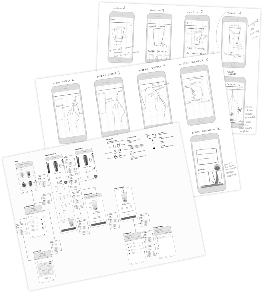
Role
Solo UX DesignerDesign challenge
Conceptualize a new, native-mobile experience for ordering a drink on the goTimeline
April 2024 to June 2024 (10 weeks)Let's break my process down:

initial conception:
UX research, wireflow, IXFlow, and branding
01
frames and assets:
animation sketches, interaction guides
02
the magic:
After Effects, keyframing microanimations
03
my reflections:
very hungry, extremely proud
04
initial conception:
UX research, wireflow, IXFlow, and branding
01
The Problem
I created CosmoTea out of a frustration that ordering on boba apps is often confusing and difficult, especially on the go. After some research, I realized that this was not a problem I faced alone, and isolated three of the largest pain points I, and other users, experienced.
 inefficiencies (redundant screens)
 stress (cluttered design)
 mistrust in the brand (inconsistent design)
How might I create a more enjoyable experience by enhancing user flows and utilizing microinteractions?
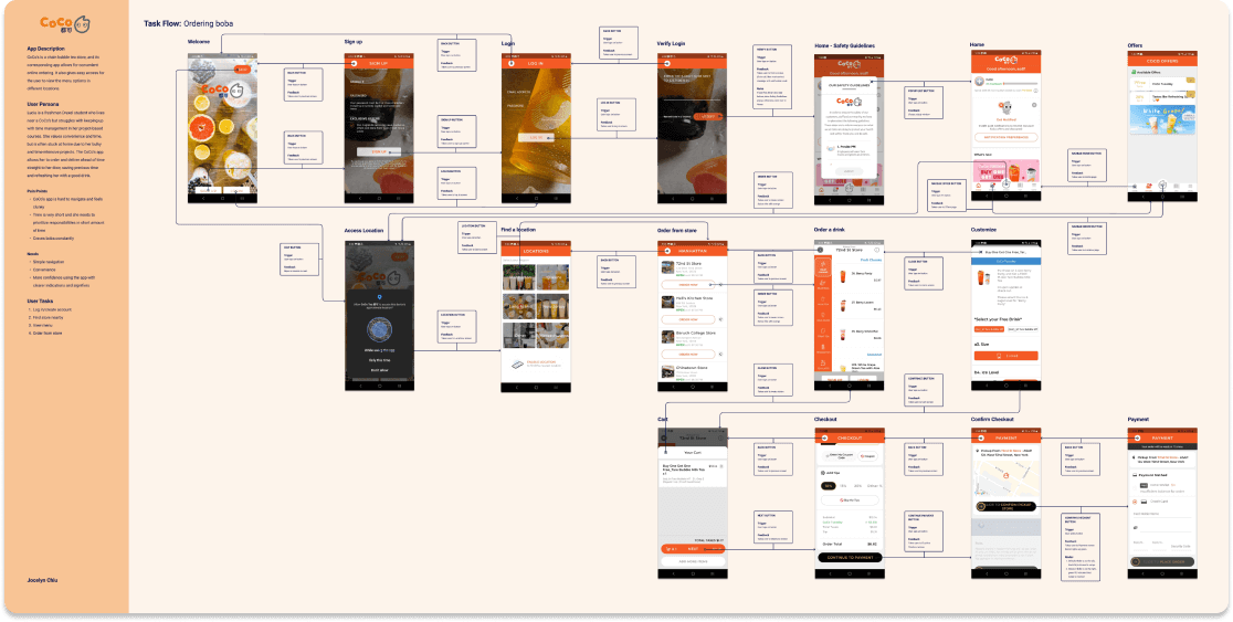
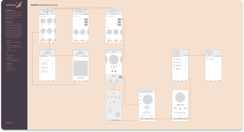
Identifying Task Flow
To outline the existing user flow of ordering, I performed a task flow analysis of what I interacted with to achieve my task. The flow featured an unnecessary amount of screens for selecting stores, navigating through menus, and more.
Personas
Researching the Users
To understand who are the prospective users, I delved into tertiary research which outlined the demographics of those who order from bubble tea stores, learning that most users:
- Live in suburban areas → Generally on the move
- Are 18-30 years old → Skew towards the younger end
As such, my user persona was created to reflect this research: Lucia!
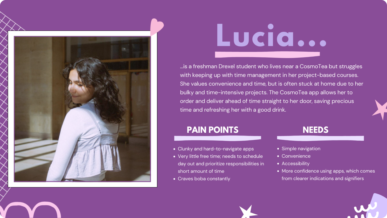
With this research taken into account, I chose to focus on an audience who would be more inclined to include thematically interesting aesthetics for younger audiences large imagery and simple iconography for older users.
Validating the User Flow
To understand the specific pain points of the user flow that people like Lucia struggle with, I performed a usability test and created a user journey map for notable responses and emotions expressed.
The most notable painful experiences with the original app was redundant screens, followed by unnecessary features, and low confidence/confusion around the home screen and payment options.

Wireframes, Branding, & Flow
UX → UI: Sketching IxD Wireframes
After having done the appropriate research, I sketched a total of 40 screens and animations for every single user interactions!Key Takeaways
Wireframes and Wireflow in Figma
With the sketches finished, I created wireframes and mockups of what I wanted the finished product to look like! Here's some of the wireframes, followed by the wireflow - which outline every interaction that a user takes in their journey to order bubble tea.


Branding: Colors, Name, Iconography
Colors manifested into:IXFlow in Figma
Below is the IXflow, which encapsulates every interaction the user could perform, down to the tap of a button.
Now that all of the framework is cleared for the microinteractions, it's time to sketch out the animations!
frames and assets:
animation sketches, interaction guides
02
Creating Microinteractions
Sketching Microinteractions
I sat down for two hours to sketch out every microinteraction by hand, breaking down every possible interaction a user could take in their journey.My goal was to create an experience that feels like it exudes life and breathes from every single element.
No design decision was ever made without a reason.

Interaction Guide
I finalized these animations by creating an interaction guide in Figma, which would later become keyframe animated in After Effects.
While it seems like a short step, it took a lot of time and was much needed.
Recreating all keyframes on Figma allowed me to use AEUX to transfer the elements to After Effects layers.
Now begins the real beast: After Effects!
the magic:
After Effects, keyframing microanimations
03
Animating: Bringing Cosmotea to Life
Animating in After Effects
While this wasn't my first time using After Effects, this project pushed my knowledge to its limits.After porting the layers via AEUX, I keyframed the elements to feel seamless, aiming to create a reaction for every possible interaction a user takes in the app.
Animation Easing and Curves
This project was an exploration into the concept of timing and easing in animation.In considering the pacing and motion of the application, I discovered Flow, an After Effects extension that easily applies adjustable animation curves. This played a tremendous part in ensuring that the timing felt natural.

With everything said and done, here's my final product!
As much as this was a journey for the user, it was a journey for me, too.
Read on to see some of my reflections!
my reflections:
very hungry, extremely proud
04
As stated above cosmotea was an incredibly valuable experience for me. As a growing UI/UX designer and researcher, I'm hungry to learn any possible skills that can make an application feel just a little bit better to use on the user's end.
Throughout this process, I can't say I wasn't driven tired sketching at midnight at times, or hungry looking at cartoon bubble tea at others. But at the end of the day, all of it was worth it: the timing was precisely how I envisioned it to play out in my sketches, and the design of the app and branding was a simplistic yet interesting style that I'd never explored until now.
My only reservation towards this project lies in the fact that I had little time towards the end to add smaller details that could breathe more life, as Coded By Kids/Draft Studio's 2023 Tech and Innovation internship started on week 8 of the project, and I shifted some of my focus towards mentoring students in UI/UX within the duration of the project.
Even then, I believe that this is one of my favorite works of design thus far, and I can't wait to transfer my learned microinteraction and After Effects skills to more projects in the future!
Thank you for making it to the end!
designed and developed
by Jocelyn Chiu
(that's me!)